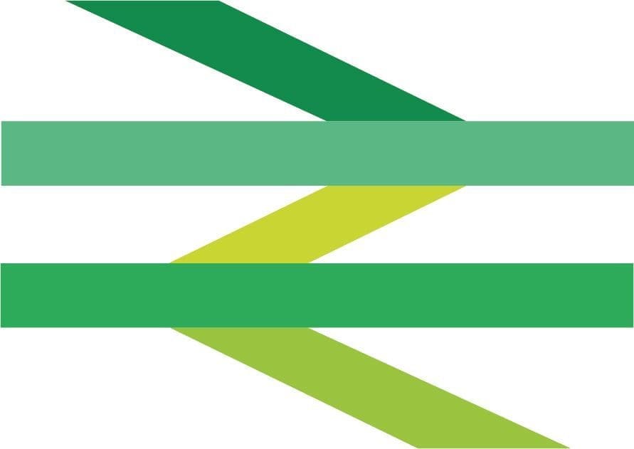
Gerry Barney, the designer of the British Rail logo, has warned against an attempt to give the logo a green makeover.
In a move to underline environmental benefits of rail travel, the Rail Delivery Group (RDG) revealed the traditional logo but coloured in five shades of green.
RDG wanted Mr Barney to endorse the makeover, but he has since told The Guardian he was appalled at the new logo.
“I think that’s rubbish,” he told The Guardian. “I could understand it if they had just swapped red for green. But why on earth have they got that many colours? It’s a load of old b******s. It’s just a mess.”
Grant Shapps, Transport Secretary, said his plans for the new Great British Railways will include updated versions of the classic ‘double-arrow’ logo when launched next year.
Mr Barney, who designed the double arrow logo as a young lettering artist, is also wary of Shapps’ plan for an updated logo based on the original version.
“I don’t know if it can be updated, it’s so simple,” he said. “They should just leave it well alone – if it isn’t broke, don’t fix it.”
Barney came up with the idea for the logo on his commute into work at the Design Research Unit in 1964.
In an interview with The Guardian, he said: “The only thought I had was railway lines coming and going.”
“I did a sketch on the tube on the back of an envelope. It really was an envelope, and I wish I could find it now, it’d probably be worth a fortune. When I got into work I drew it up.”
The design was selected by the board of British Railways, chaired at the time by Dr Richard Beeching.
Mr Barney suggested that, instead of using different shades of green, boldening the logo would be a better transition.
“The first time I sketched it out I covered a whole train with it, from roof to rails, so you could see it a mile away. It looked bloody great, but they wouldn’t do it. They were too apologetic about it, treating it like a badge rather than something they were proud of.”
Check out the full interview with The Guardian here.


